Packaging design is simply although many designers approach it from the wrong angle. Obsessed with aesthetics they give little thought to their market, function and neglect that it has to work with many variables.
The following articles outlines some of the basic principles for successful packaging design.
Show the product
Sell the benefits
Know who your market!
You may be asking why ‘know your market’ relates to an article about packaging design. Simply put successful packaging needs to be backed by solid marketing. Knowledge is key, it’s the foundation on which great design is built. Knowing gender, personality traits, socioeconomic position and so on are all crucial. All of this information determines colour, font style, tone of language and key messages.
Studying your consumer and target market is crucial to the success of any type of packaging project, whether it’s a launch or redesign. You need to know exactly who your talking to so you can design packaging that appeals and communicates effectively.
Great product, great design.
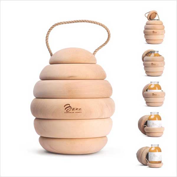
Successful packaging design works in harmony with the product. This means the packaging and brand reflect the personality and type of product. This can come down to shape, colour, material and photography. For example, an organic body pamper pack may be packaged in natural card with minimal print and straw packaging. The image below shows packaging design for premium honey where the pack immediately makes you think of bees.
Creative BUT viable
Think shipping, think units cost, think stacking and think about protecting the product. An egg box is probably the best example of practical packaging. Every aspect is covered. They’re cheap to produce on mass and they protect the product in transit. Way to many designers just get creative and don’t consider budget or the practicalities of shipping. All of these aspects need considering from the outset. Ask yourself what is the point in producing a great design that costs more to manufacture than your product itself. Or, you’ve got a wonderful looking box design that your customer gets home to find everything inside is damaged because it’s not been protected. Think practical first and build of that.
Build your brand
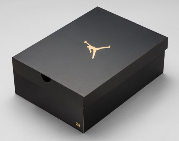
It may seem easy to simply feature your brand on your packaging BUT some designers get it wrong. Position and size need to be considered based on how well known the brand is. Ask whether you lead with the brand and get it to sell, or if presenting a strap line first works better. Also, consider the product type, if you’ll only ever sell one to each consumer then it will be less prominent giving space for the message or strap line. The shoe packaging below is a good example of building and presenting a brand. Clearly Nike and the Michael Jordan brand don’t need to work that hard to sell, therefore the packaging is very simple allowing the brand to do all the work. Also the product itself will feature on a shelf so the purpose of the packaging isn’t to jump off a shelf but to provide protection to take your shoes home.

Get it right
In summary, don’t be blinded by pretty design because it won’t necessarily sell your product. Instead make sure your designer has good knowledge of your product and understands the benefits. Make sure your packaging company has all the knowledge and research available on your target market. Practical packaging design wins, start with a budget based on your unit cost and work from there. Above all build a strong brand and sell on benefits.
If you would like to speak to a packaging specialist for a free consultancy session then call us on 0191 2267321
